Case Study Osher Lifelong Learning Institute at Colorado State University
Class registration and student information system for Osher Lifelong Learning Institute at Colorado State University.
Opportunity
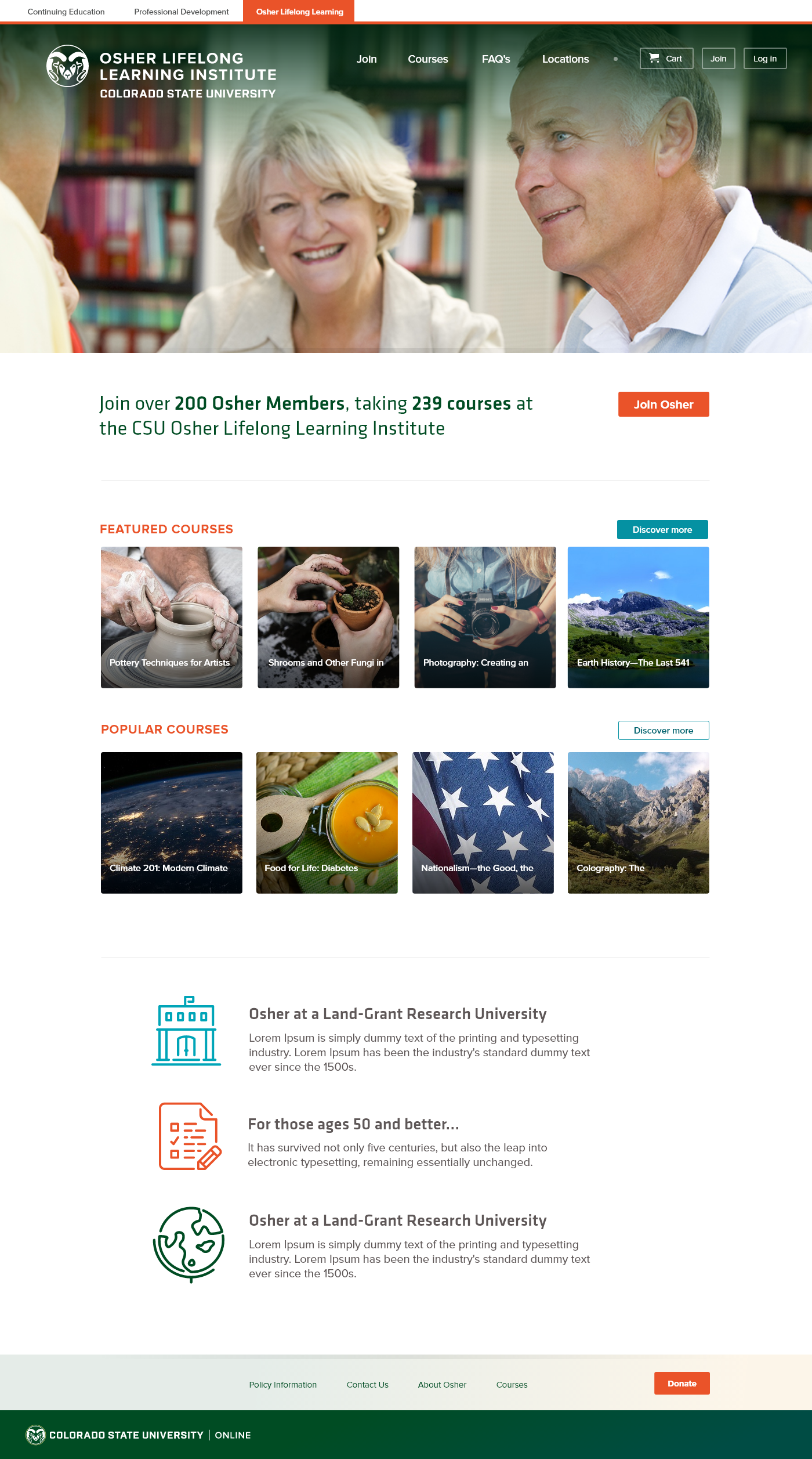
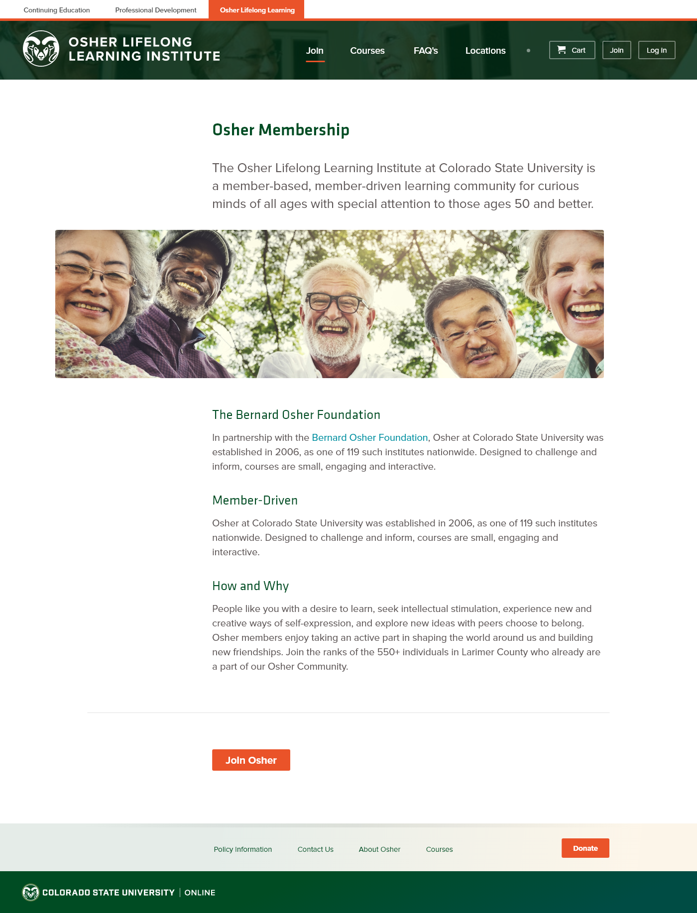
The Osher Lifelong Learning Institute (OLLI) at Colorado State University (CSU) provides intellectual nourishment to seniors and retirees throughout northern Colorado. OLLI was interested in expanding their reach throughout the community. To do so involved breaking the 1,000 membership threshold to access additional funding from the Bernard Osher Foundation. To this end, my project team and I were asked to reimagining what a new OLLI registration experience might look like, as part of a broader effort to refresh the Division's online presence.
This project included the following non-functional requirements, per CSU policy:
- WCAG AA accessibility compliance
- Alignment with Colorado State Unversity brand and style guides
Process
Research
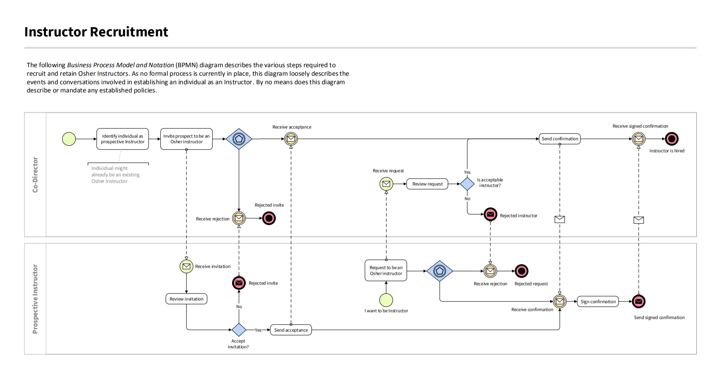
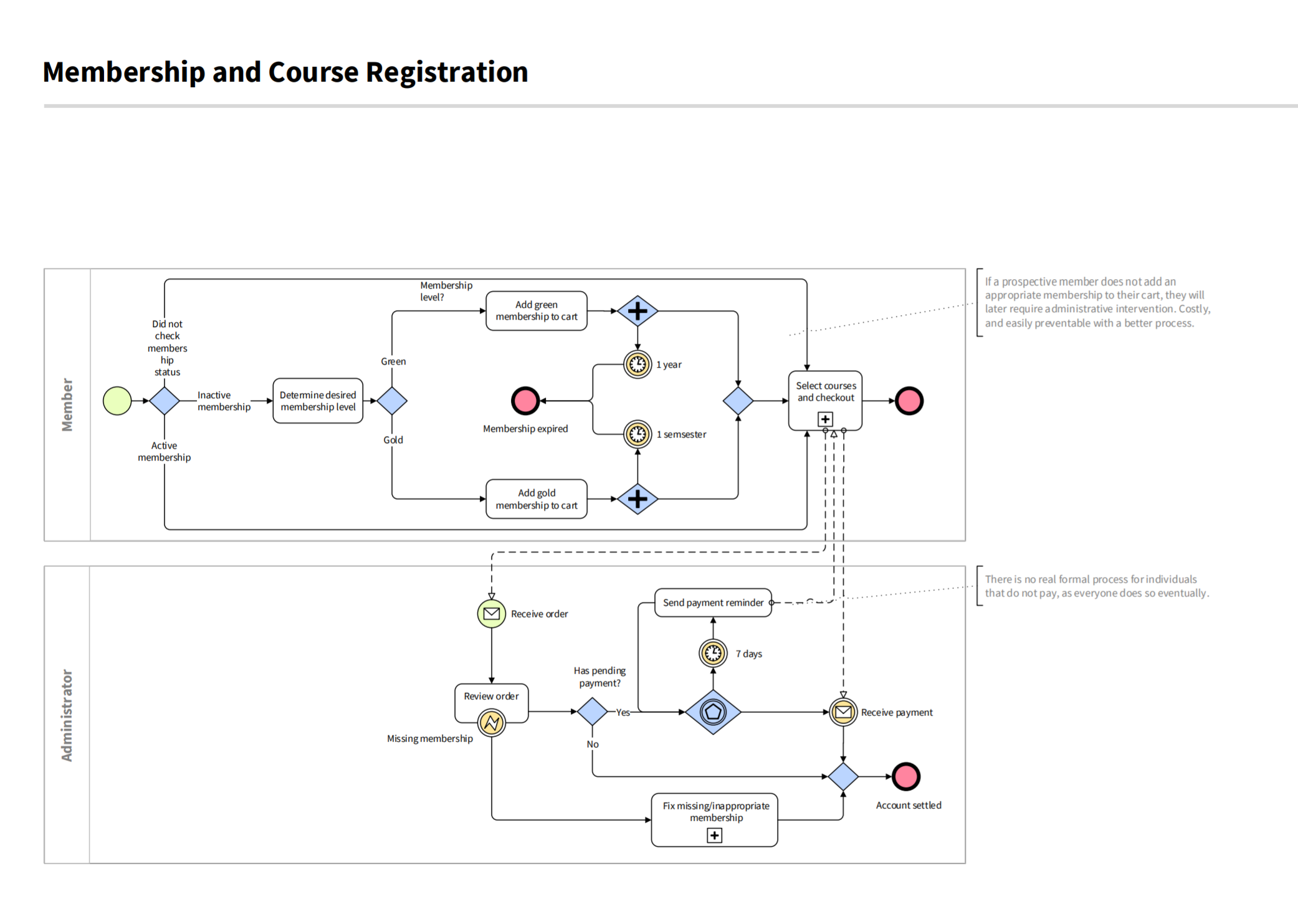
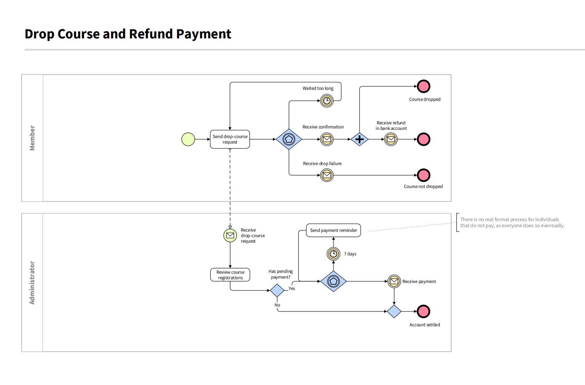
Early rounds of interviews with stakeholders, SMEs, and Osher members revealed that the user experience for course discovery, registration, and checkout were particularly cumbersome. These interviews helped identify the target audience, revealed UX pain points, and let me synthesise a series of user workflows (delivered as BPMN diagrams, samples shown here):
Design
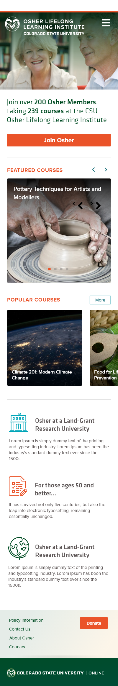
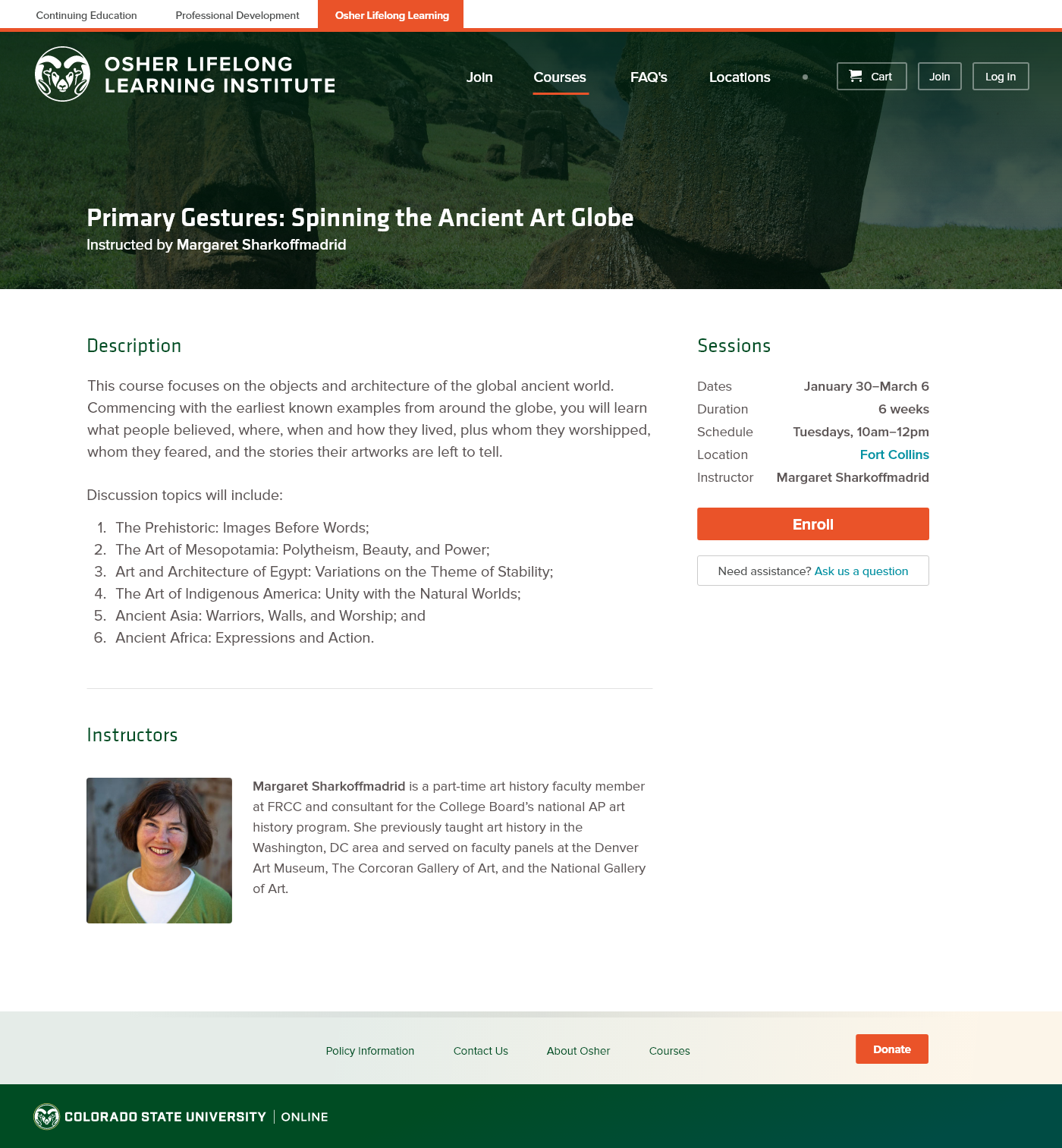
Off the back of our UX research my team and I generated a set of user stories describing key features. Workflows and stories came together, initially, as wireframes and then later as gray-boxed designs we could use for prototyping. By presenting these as interactive prototypes to stakeholders and SMEs we were able to continue to refine the experience:
Feature Highlights

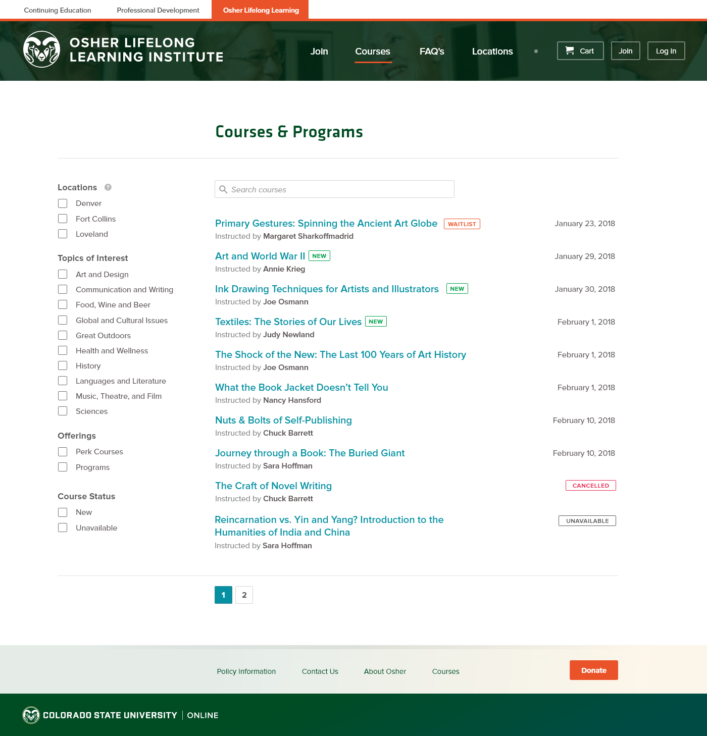
We employed a classic UI pattern: real-time faceted search to solve this. Facets (dimensions) were determined by a brief analysis of the way members typically identified courses of interest; however this solution was constrained by the data points available to us by the underlying systems. Sometimes even the best solutions must be a compromise!
Our approach meant we could reuse components and layouts, swapping out images, copy, and accent colours to form a cohesive experience between each offering. The sister-site for the newly envisioned CSU Professional Development experience is shown here.
Our research also highlighted the need for clear, timely messaging to members. In addition to real-time notifications through email or SMS for class rescheduling or cancellation, we also decided to render messages on the front page to overcommunicate this vital information. Our solution involved the use of iconography, placement, and colour.
Outcome
The first iteration of the site launched in the Autumn of 2018 and received positive feedback from students and OLLI staff. As with many projects, many of the opportunities identified at the start the project will take time to gauge, with the next set of iterations still to come.
In addition to the above deliverables, this project helped me become a better UX researcher, specifically. The target audience for Osher offered a unique challenge and required collecting and documenting their needs clearly and with empathy.