

Case Study Budgeting
Speculative user interface design for a personal finance and budgeting application for the web and desktop.
Opportunity
I set myself the challenge to design a personal finance and budgeting tool for use on the web and desktop. Given my work experience in the finance industry I had an ‘ok’ feel for what a product like this might look like: A simple-as-possible-but-no-simpler solution that would help individuals and families alike identify, track, and stick to a financial budget.
Process
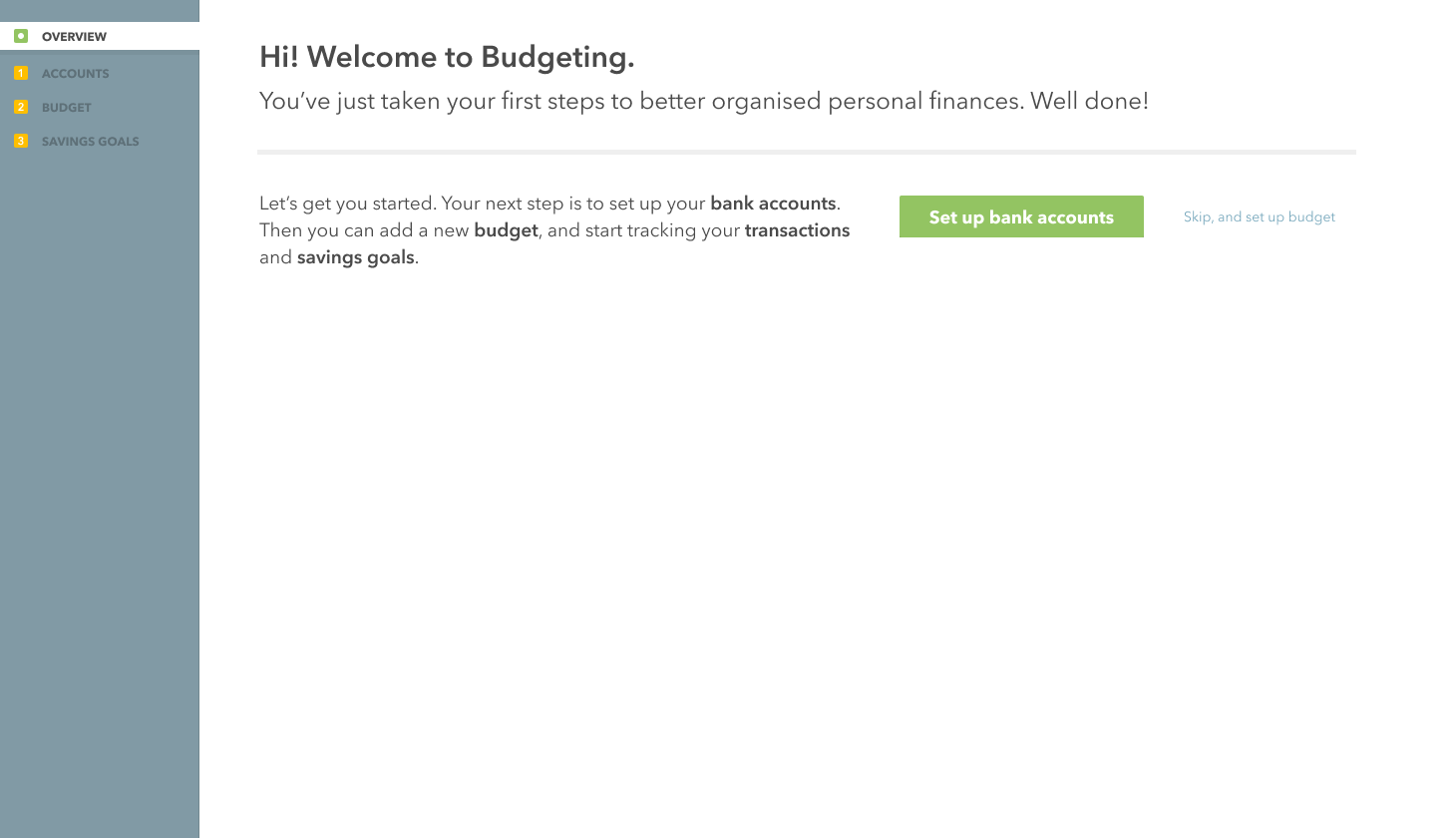
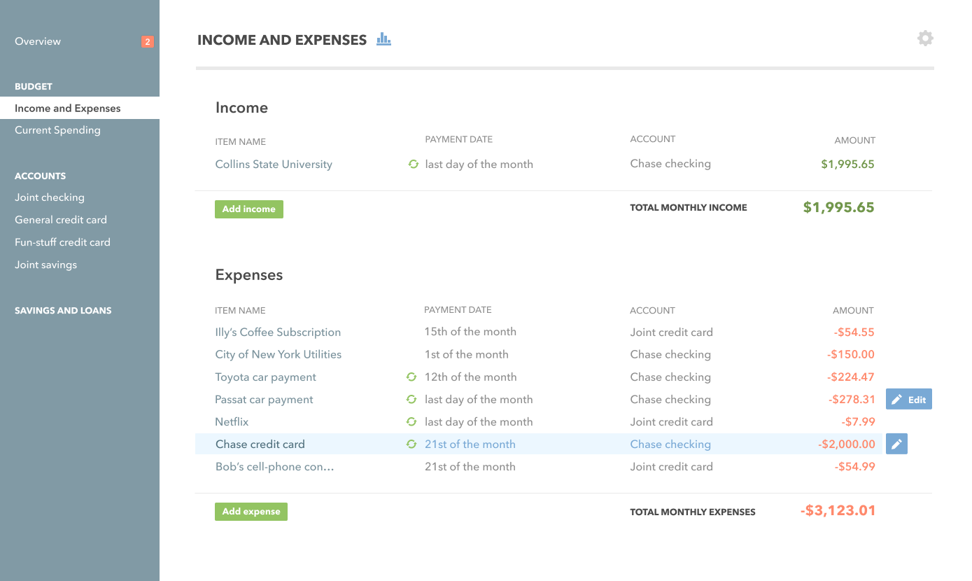
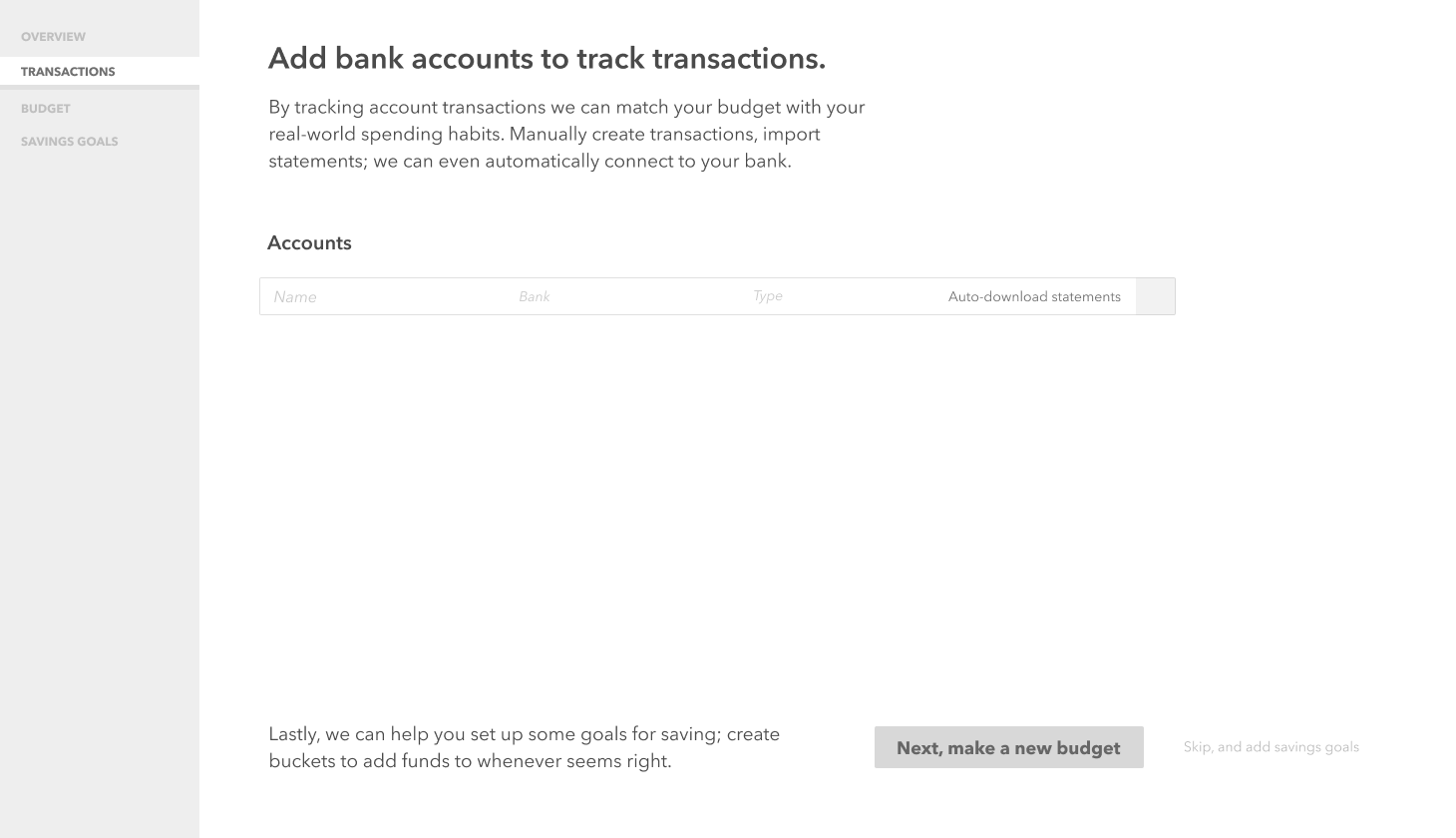
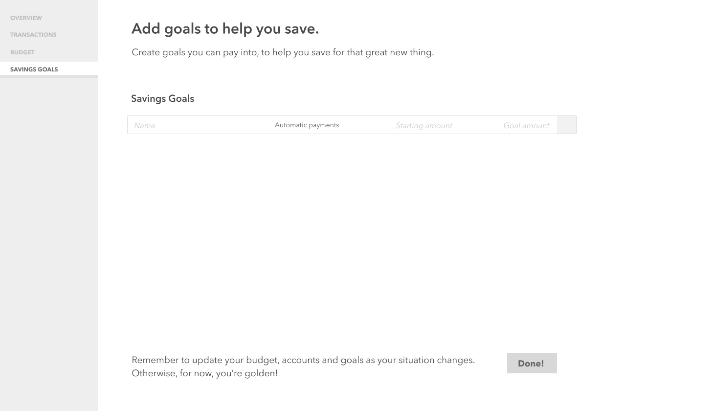
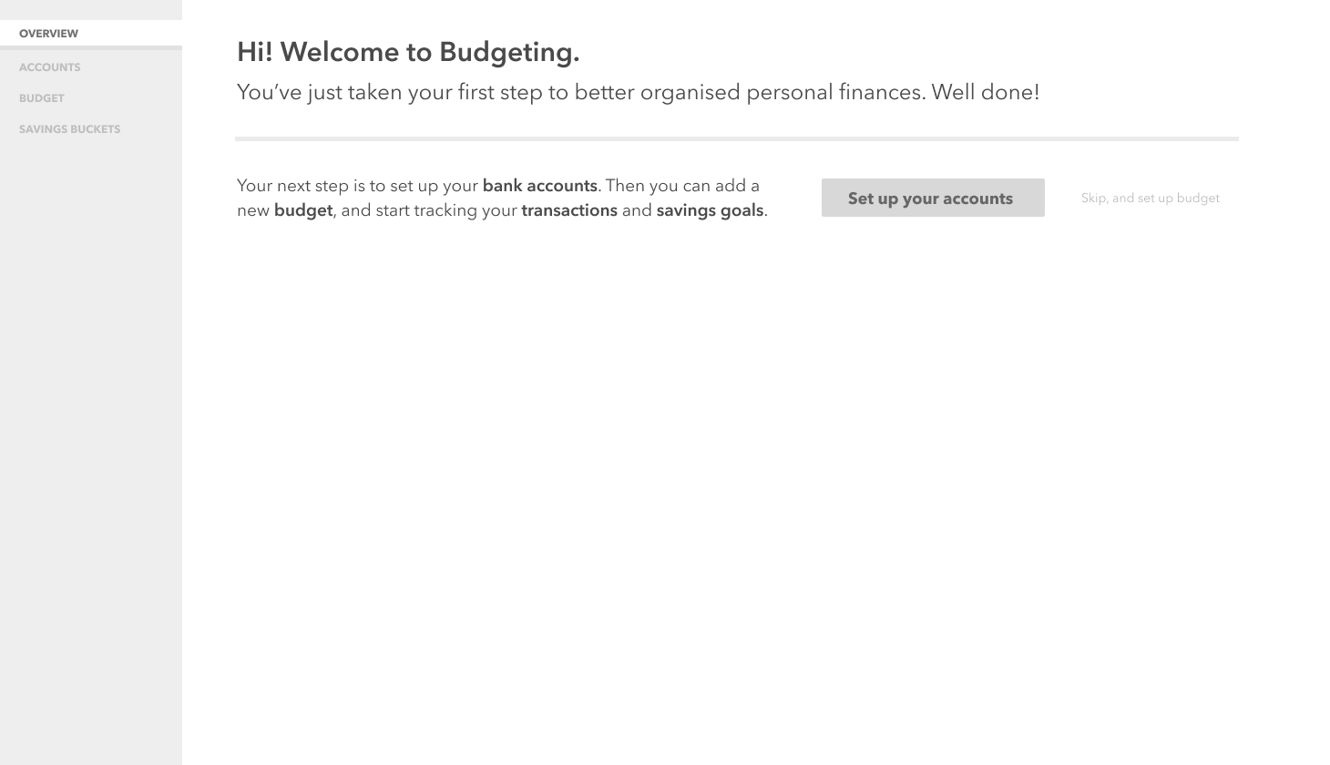
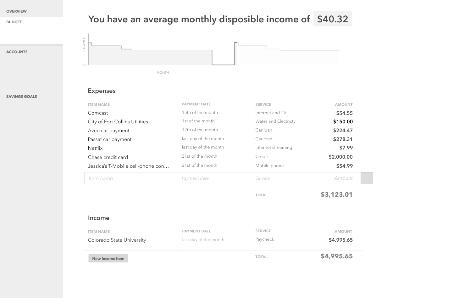
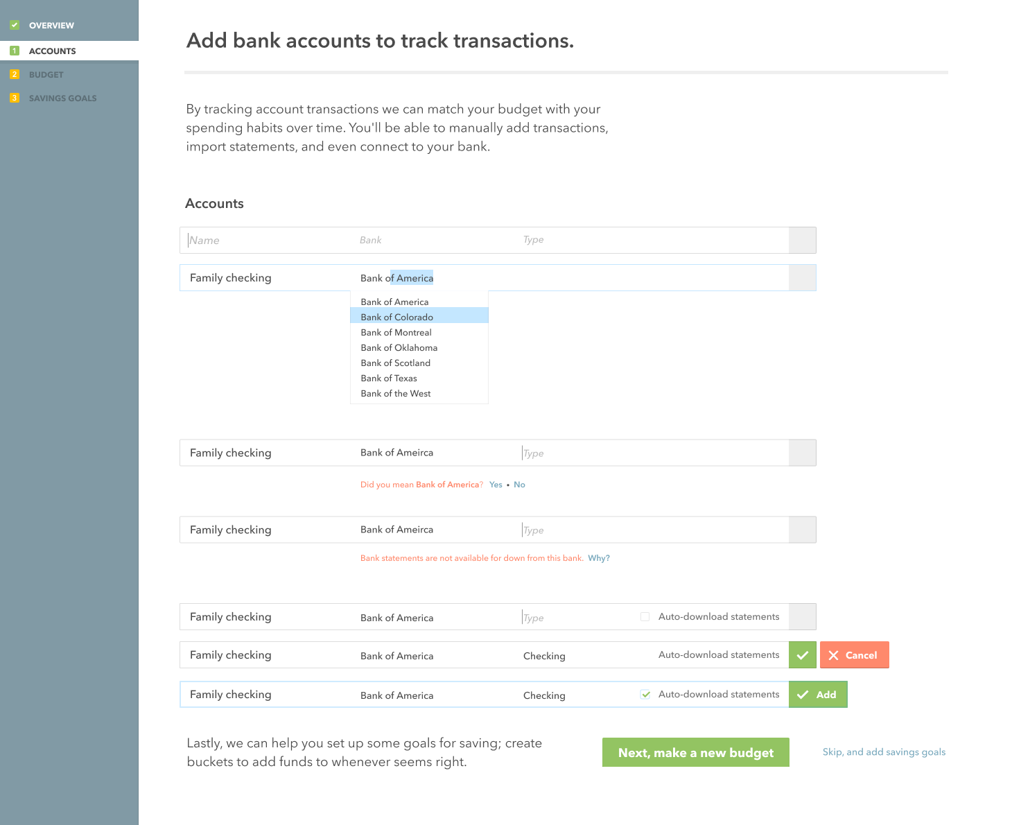
I started by considering how best to walk a new user through building a budget from scratch. This involved forming a clear mental model for the user: a budget was determined to be a set of recurring transactions, both income and expense, over a fixed period of time. All other features would successfully hang off this central concept.
Visualisations
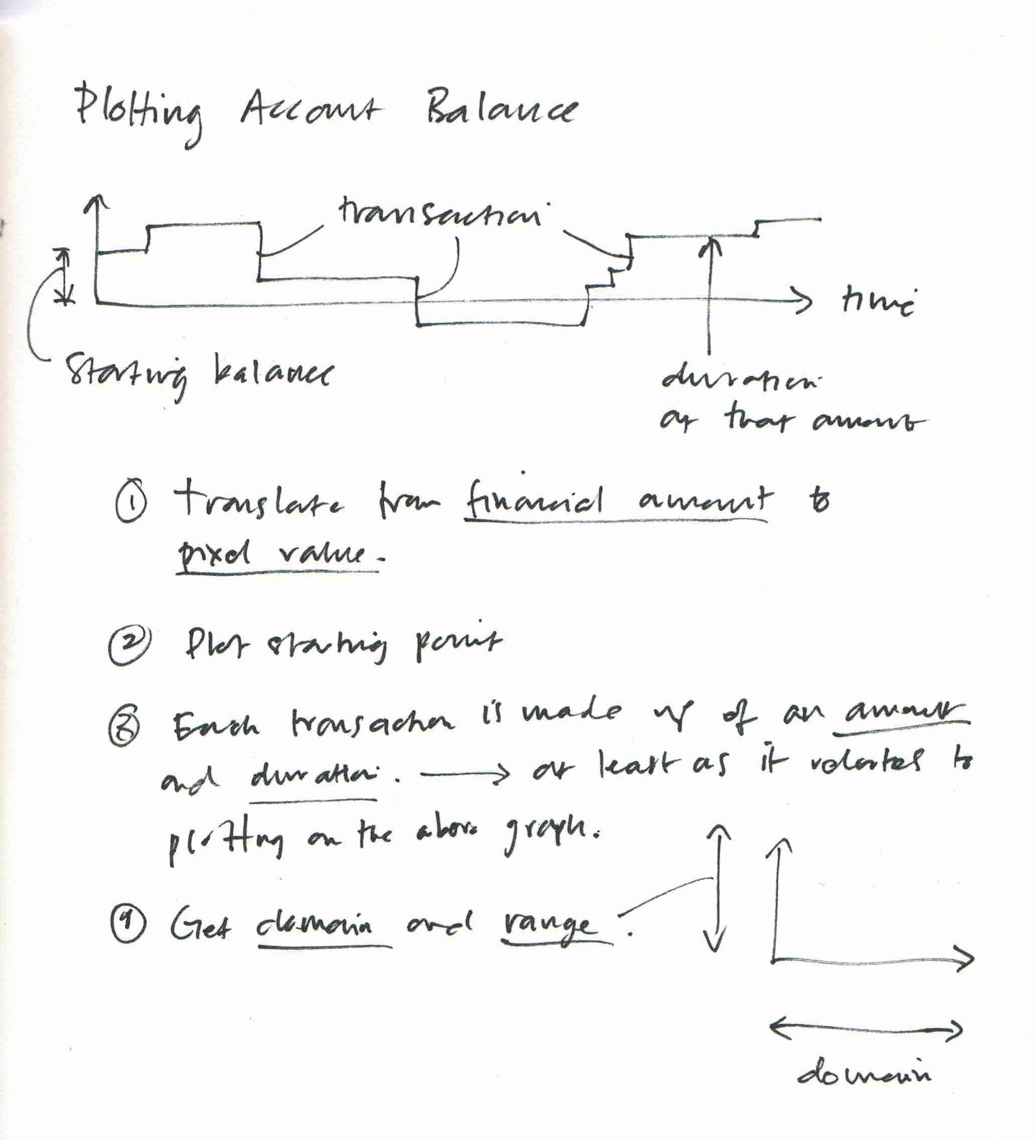
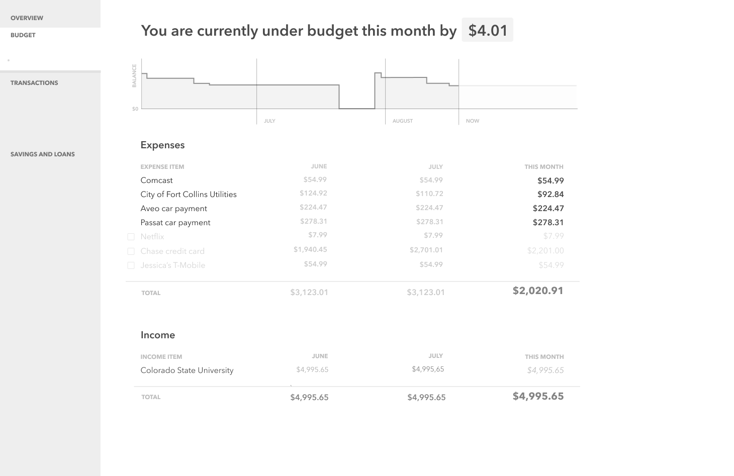
I worked out some quick sketches to think through how best to visualise account balances and transactions. There was a good opportunity to communicate accurately and efficiently with data visualisation which I wanted to explore.
Grey Boxing
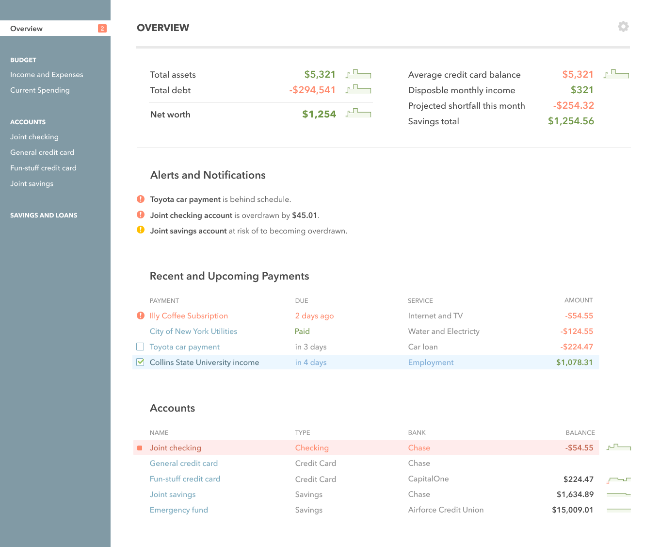
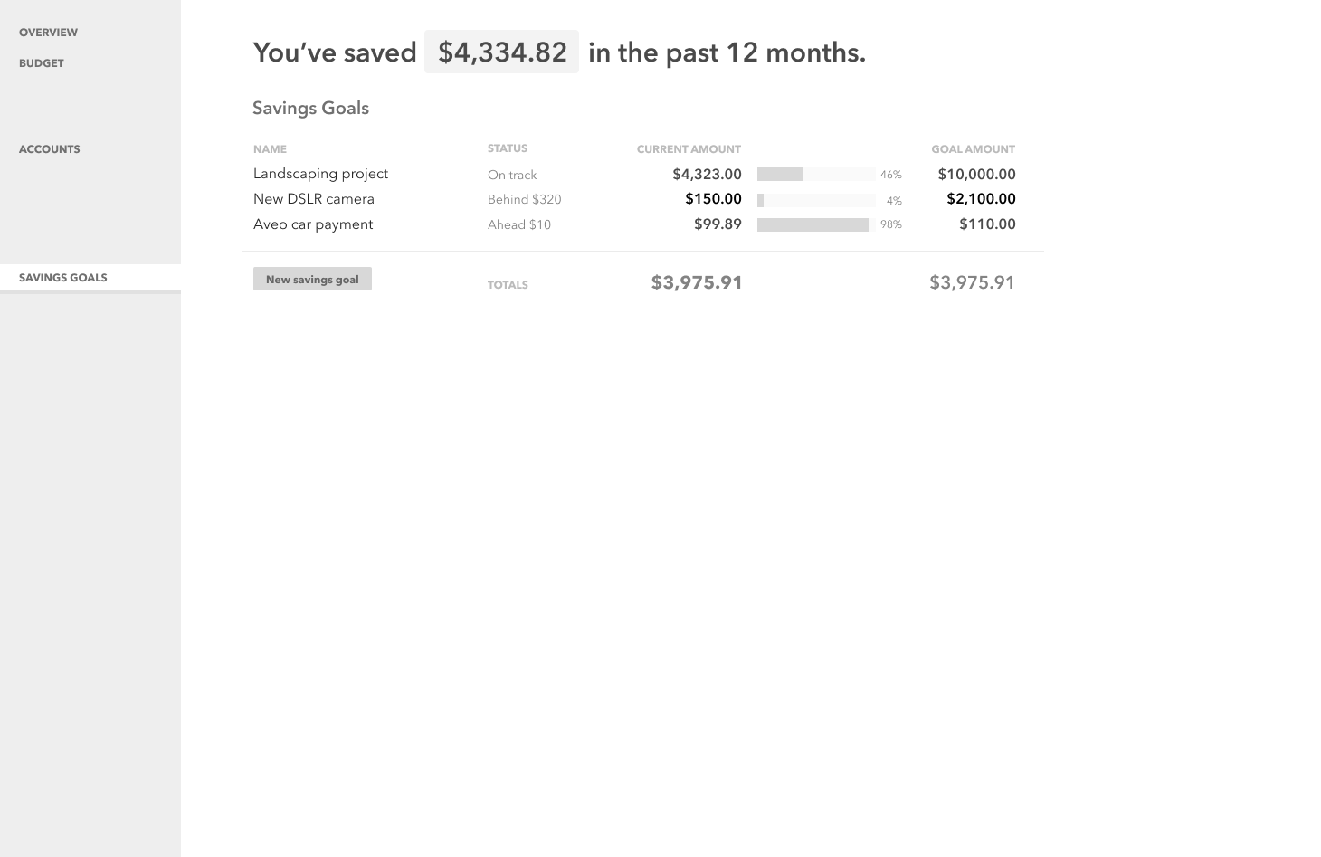
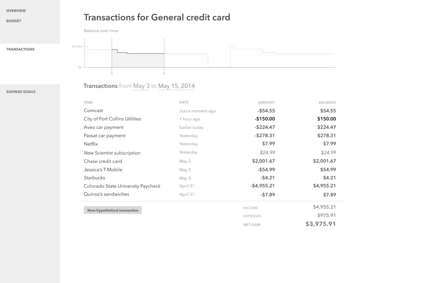
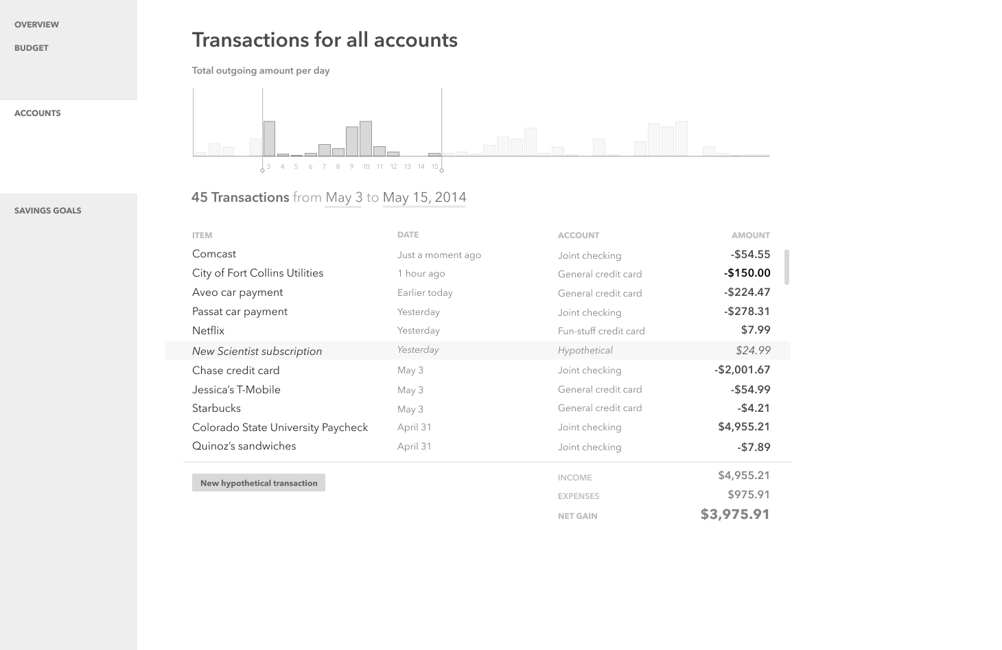
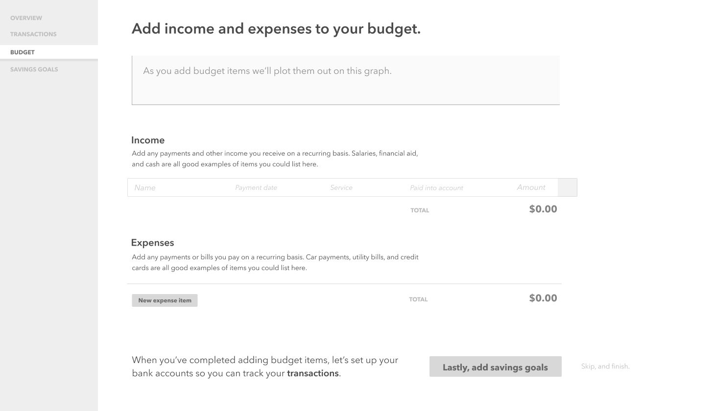
I already had a solid product vision, so felt to skip much of the lower-fidelity work; I started gray boxing in Adobe XD:
Pattern Library
Outcome
Budgeting was a challenge to myself on how best to create clarity in a complex domain: generating concise, internally consistent mental models for budgeting; condensing information in clear-to-understand visuals, including sparklines, interactive charts, and the meaningful use of colour.