Case Study Elim Springs
Marketing and e-commerce experience for event management and venue agency based in Düsseldorf, Germany.
Opportunity
Elim Springs, a small non-profit event management and venue agency based in Düsseldoft, Germany, were in need of a corporate web presence, brand, and online donation solution. In late-2019, I worked alongside Elim Springs’ stakeholders to design and develop an appealing experience, that would simplify donations, provide clear event information, and a simple means to keep content up-to-date and relevant to their customers.
Process
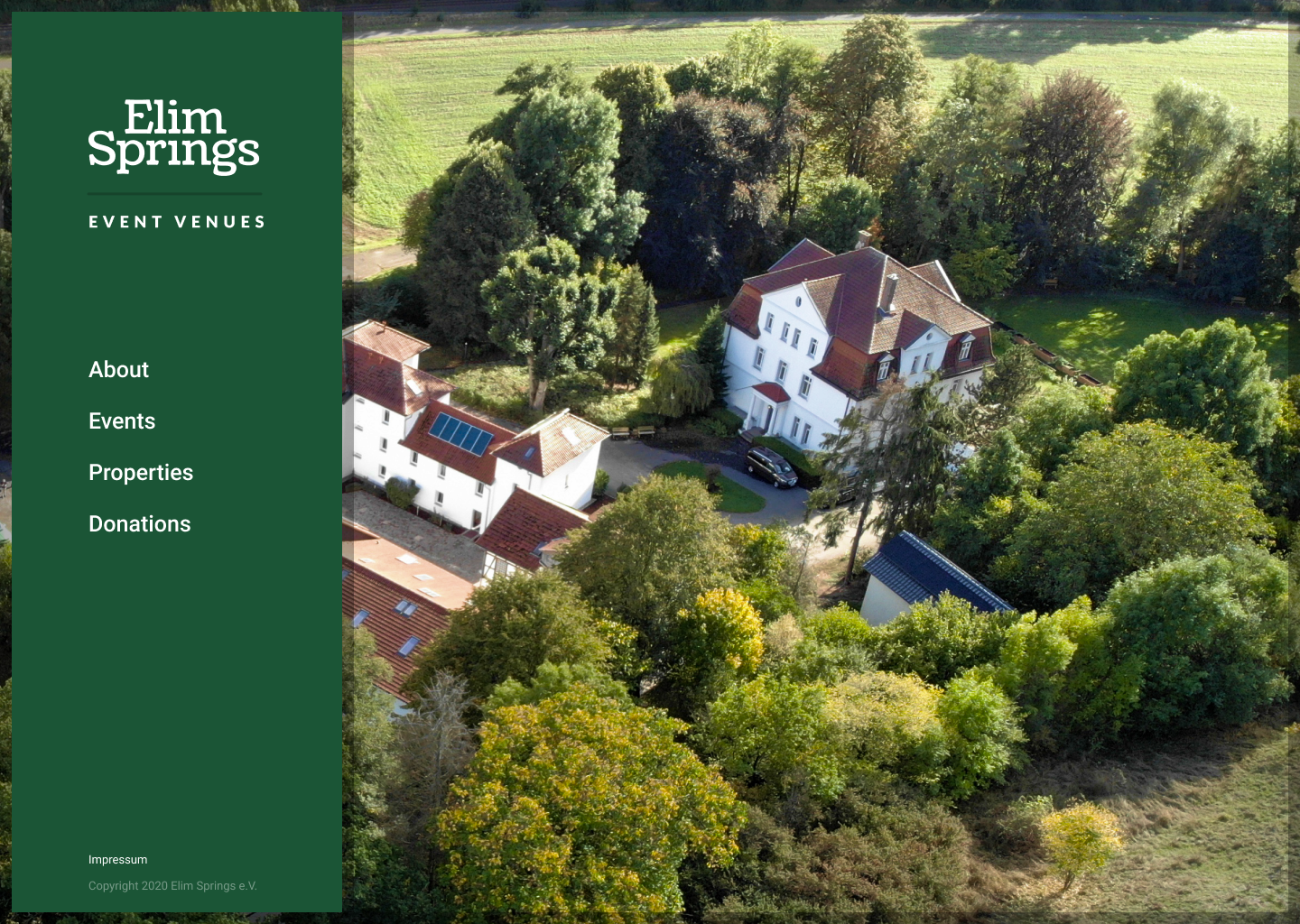
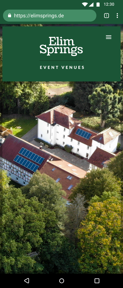
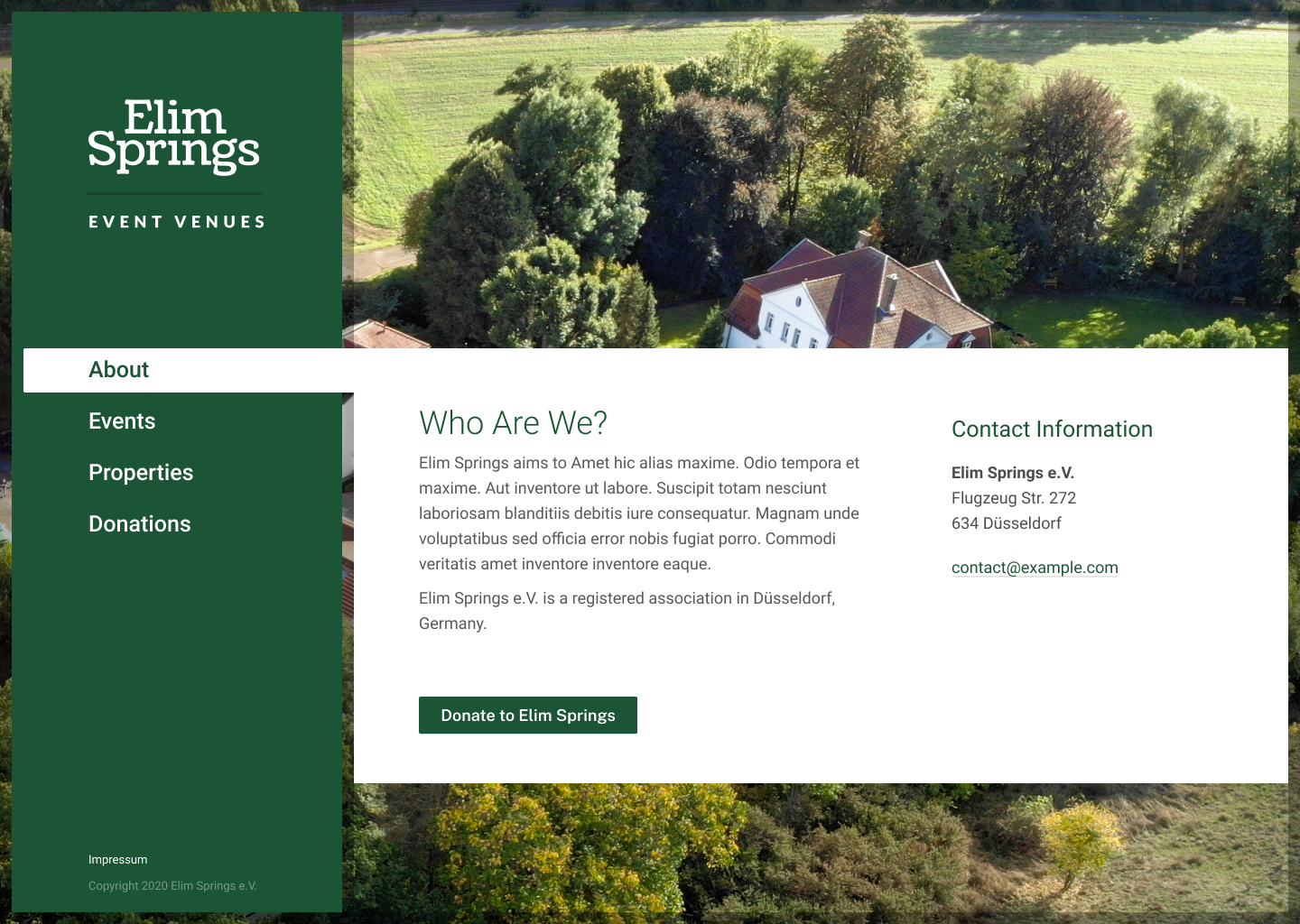
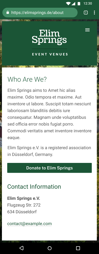
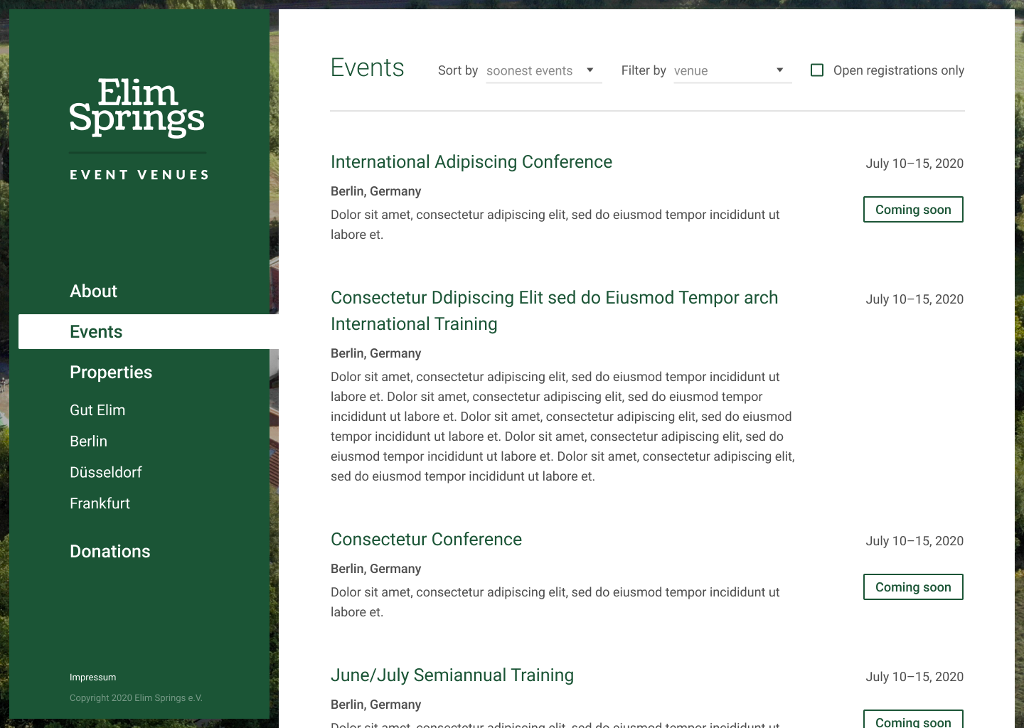
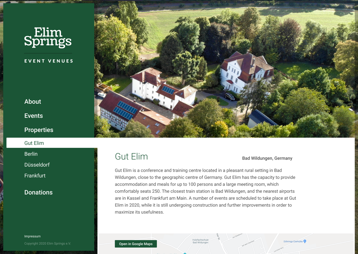
Given the promotional nature of the project, a strong visual design was paramount, and was my initial focus. After a number of iterations we came to a compelling look-and-feel that reflected the values of the organization: approachable, traditional, and trustworthy.
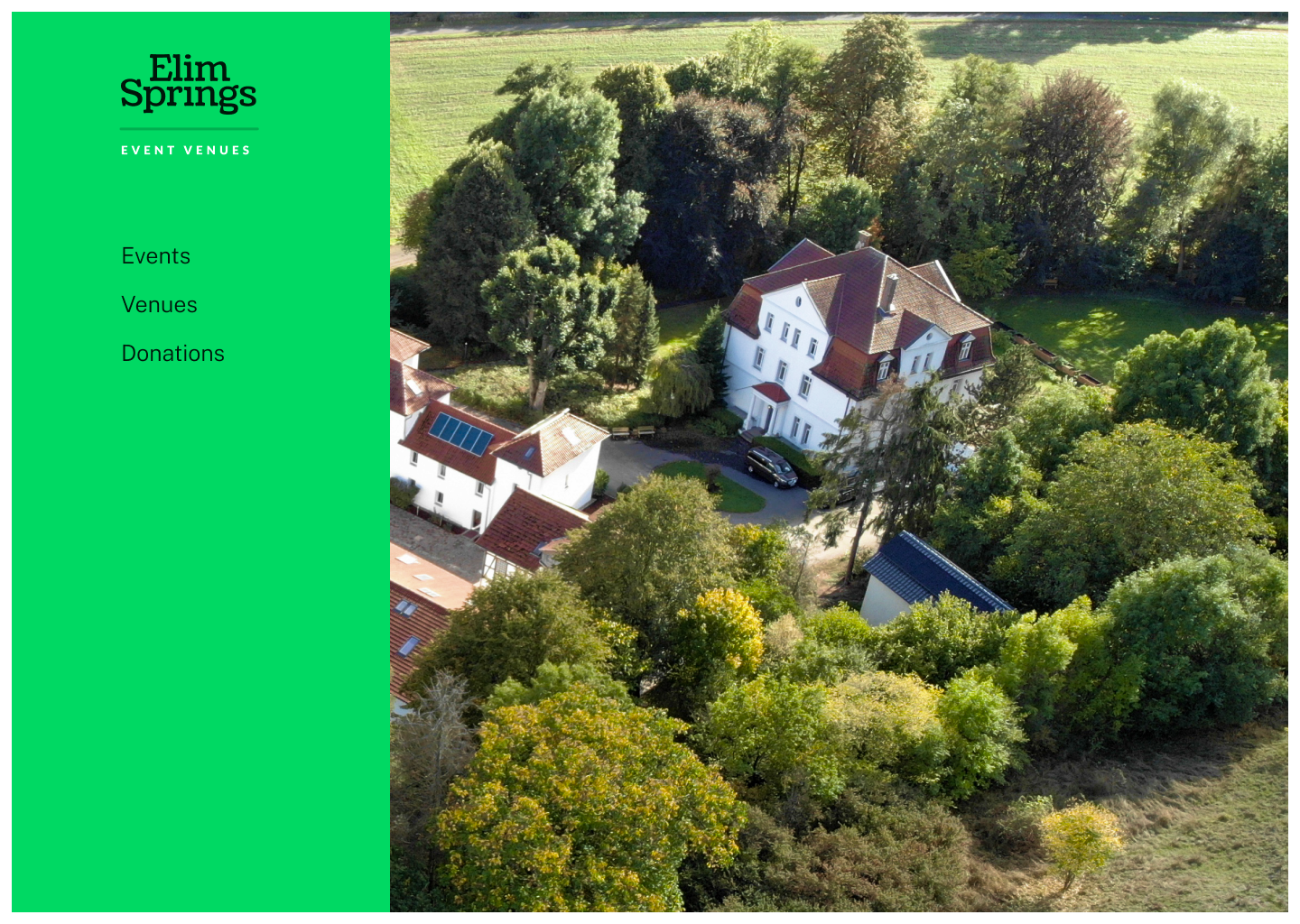
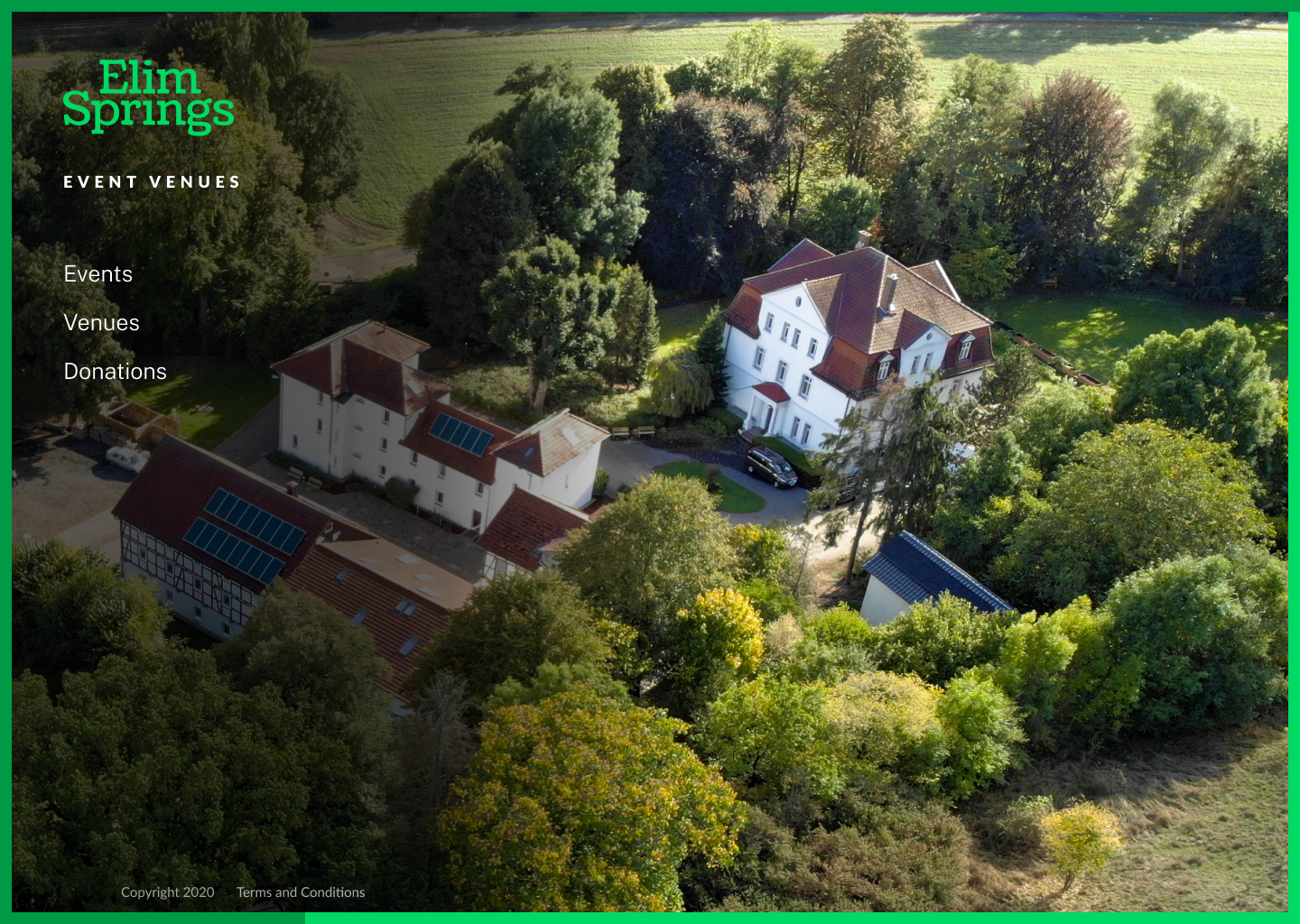
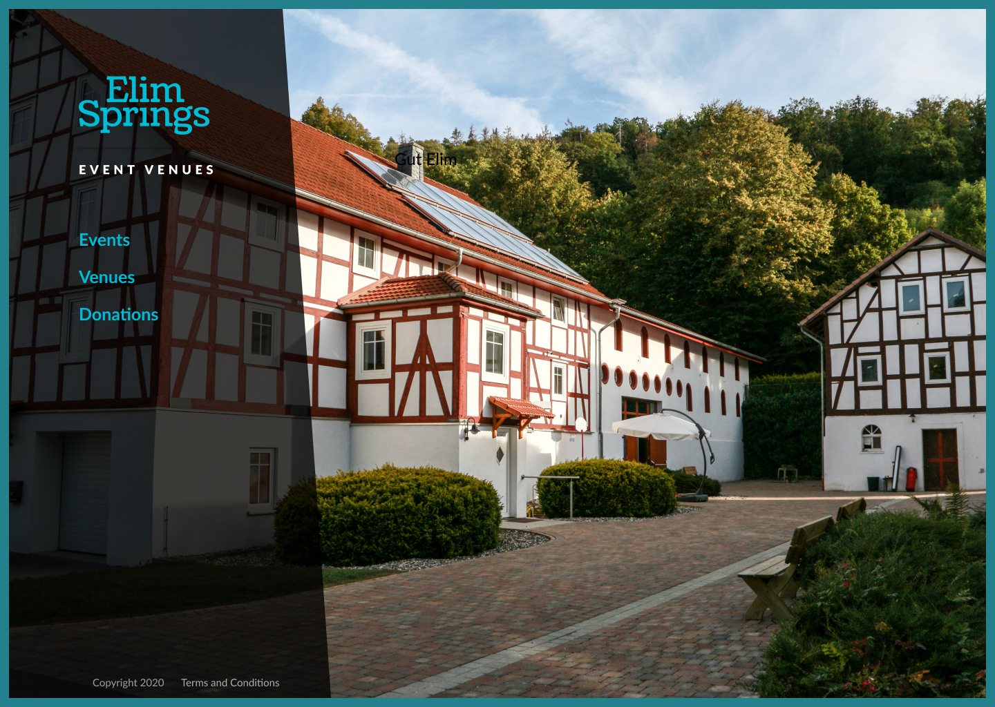
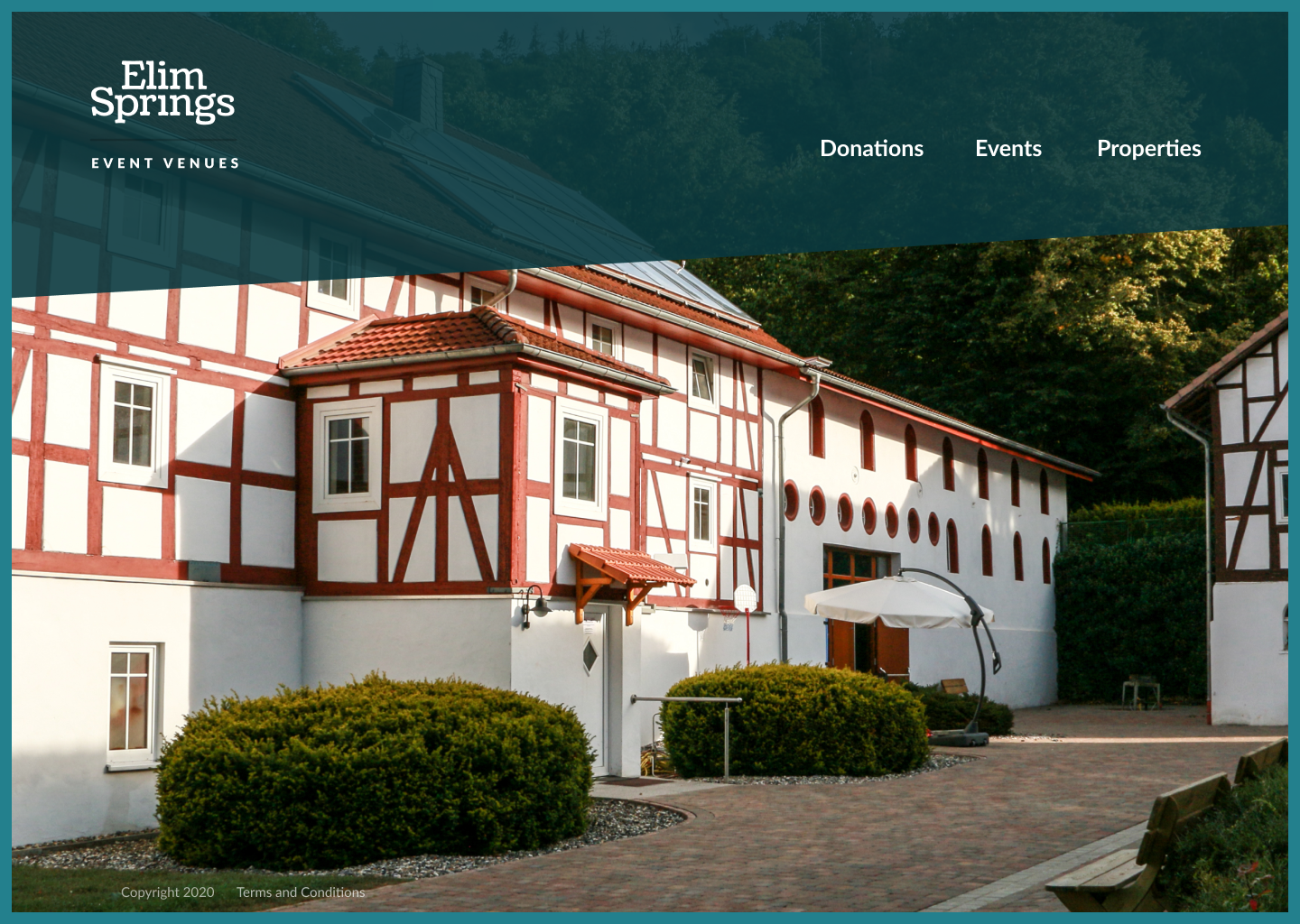
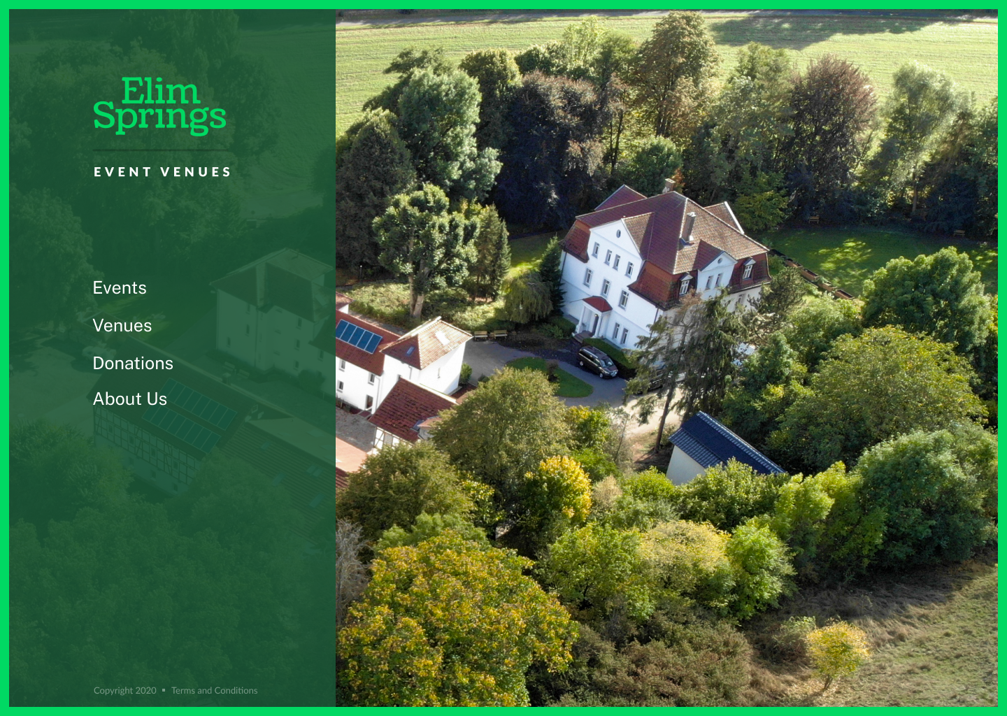
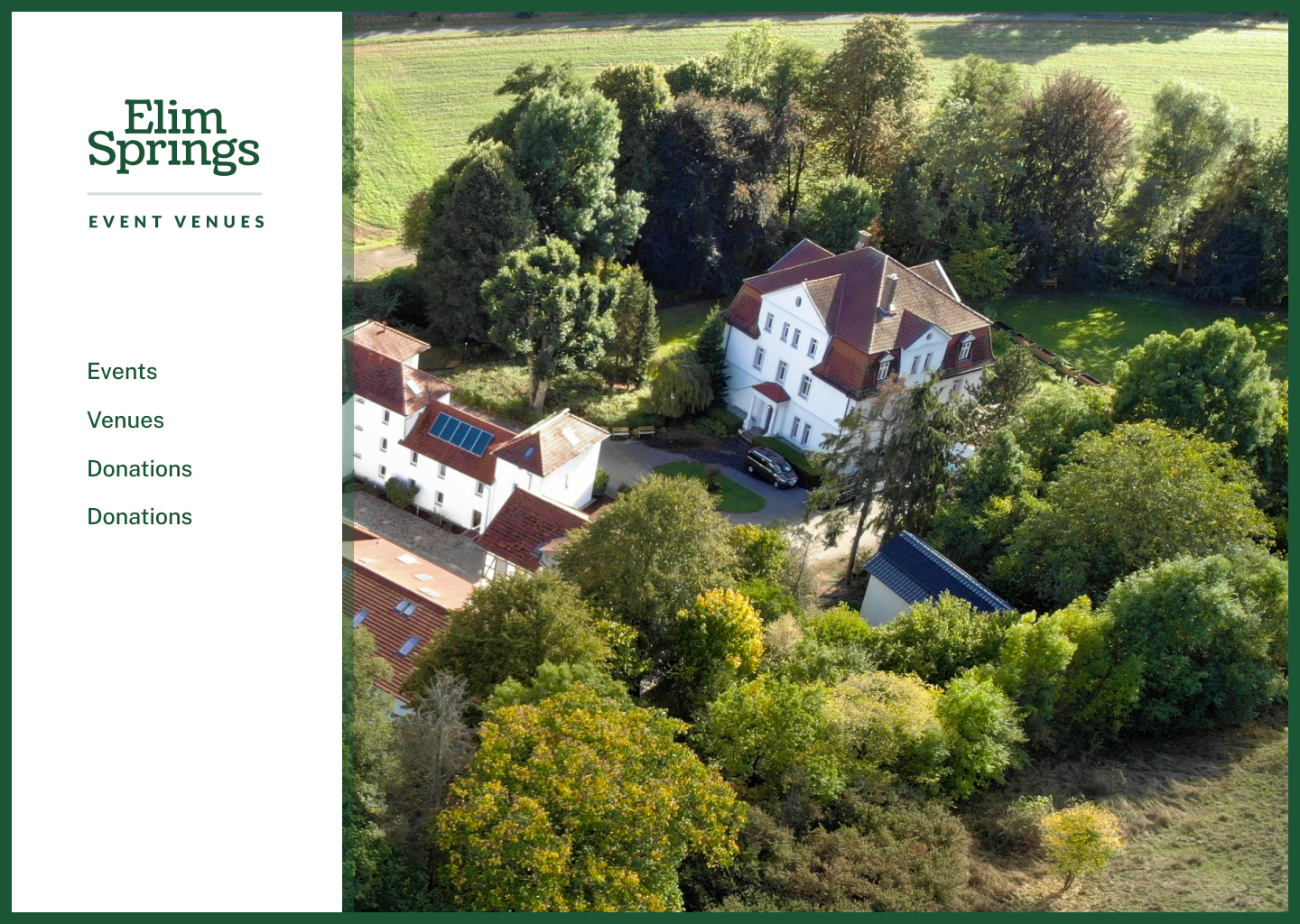

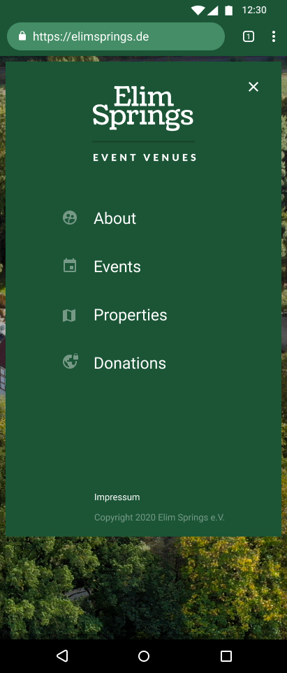
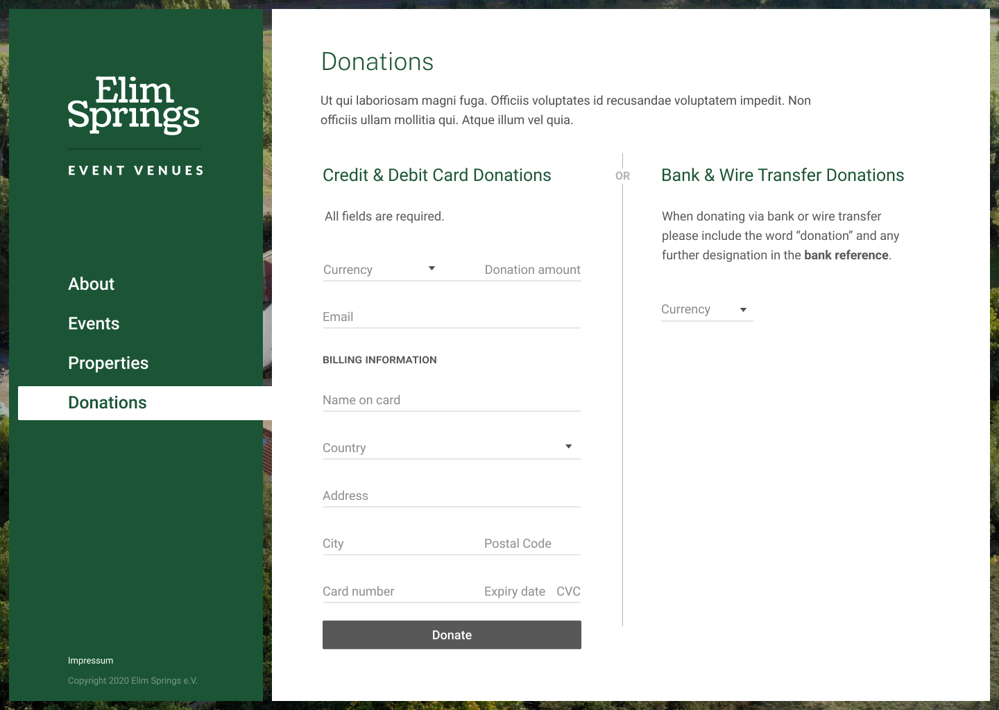
With the advent of modern single page application (SPA) frameworks that can provide progressive enhancement, performance, and accessibility, and even improve UX for content-heavy sites, it gave us the opportunity to explore several different navigation paradigms previously not within reach. This also allowed us to provide a particularly dynamic checkout experience for donations.
Through experimentation, I settled on a left-side navigation that transitioned selected content in to view. This keeps the user continually orientated and discoverability high. Best of all, with server-side rendering (SSR) and static site generation (SSG) at the core of this solution, it is usable even when JavaScript and styling are disabled, or otherwise unavailable.
Project Highlights
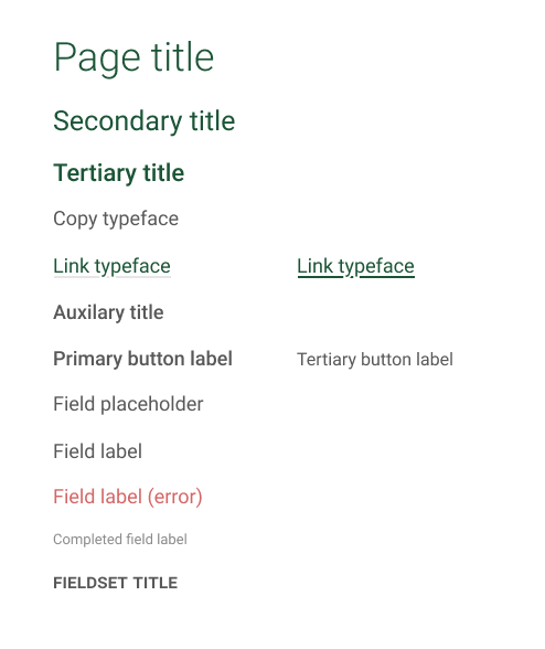
In recent years Figma has become an industry standard for good reason. Its use in this project further emphasised its utility to me. Not only did it allow me to easily share the Elim Springs prototype, but its feature set also made creating and reusing styles and components straighforward. The result was a style guide without even trying!
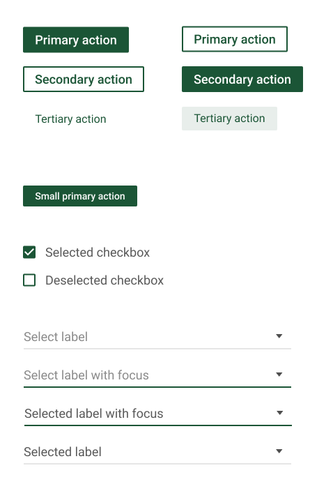
Components here were purposely based on a Material design look-and-feel as, fortunately, it fit the brief, and would reduce the engineering effort and timeline.
Brand
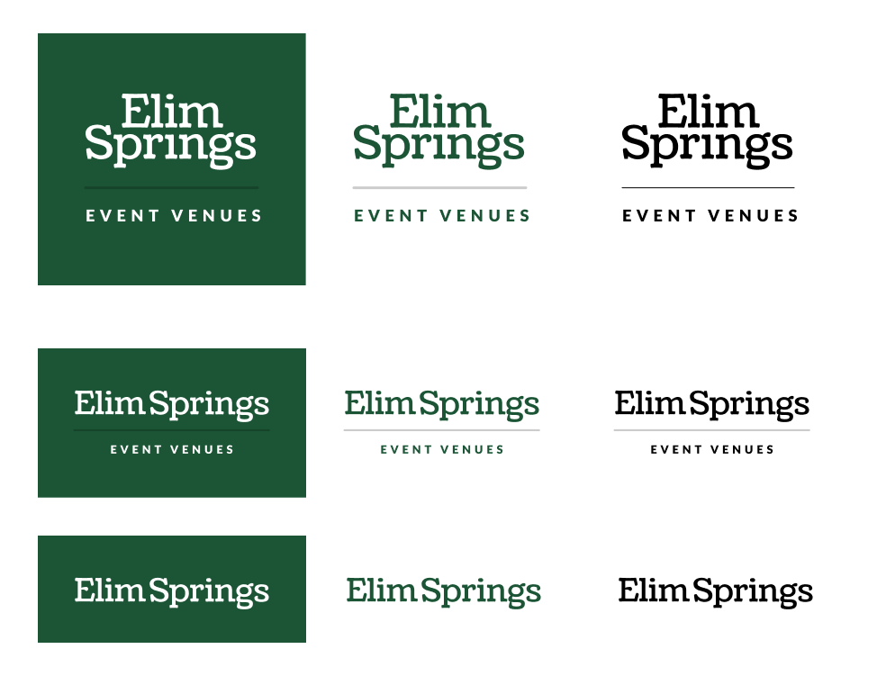
Elim Springs was small enough to have not yet fully established a brand identity. I used this opportunity to pull together a series of lockups to work for all occasions, including a standalone logo, and vertically and horizontally constrained lockups. Care was also given to light and dark backgrounds, and a monochrome variant.
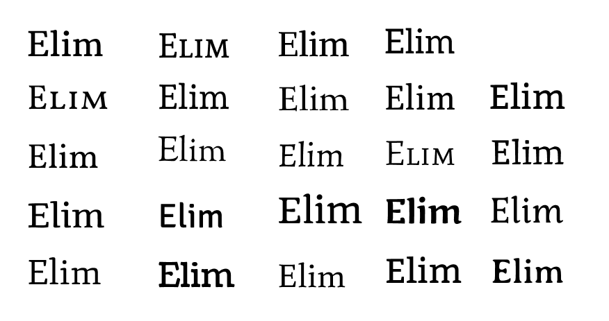
I explored different typefaces for the logo, leaning heavily on serifed styles. The goal was to balance a traditional look with a softer feel, while keeping it simple and understated.
Outcome
The above above prototype was delivered to the client and work has started on engineering. Unfortunately, progress has stalled with the global pandemic in 2020, but we hope to continue in the near future.
This project helped me become more familiar with Figma, including the use of shared libaries for components and AutoLayout. It was also encouraging to discover that in recent months SPAs may have finally come of age—delivering a best-of-all-worlds solution for accessibility, user experience and developer experience!